All this week, I’m highlighting interesting things about Empire of the Goddess. Check out the new editions.
Aha, I can’t fool you! You found me out. Your astute eye has detected an abnormality. In the back of your mind, Sesame Street is singing, “One of these things is not like the others.”
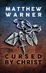

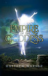
Let’s see: horror, horror, and what the hell is that. *
Two covers for the same novel? Just who am I trying to fool? Well, no one, actually. Empire of the Goddess is what you call a “cross-genre” novel. It has elements of both the horror and fantasy genres, and so I admit, in my Machiavellian calculations, that in my requests to the cover artist, I tried to appeal to both readerships. All I can say in my defense, Your Honor, is that both covers are truthful, and in fact they depict different scenes from the same story. They are not misleading.
That’s the what. Now let’s talk about the why.
I first sold Empire to a bona fide publisher who was not myself: my old friends at Thunderstorm Books. It’s always been important to me to acquire that external validation of quality from a gatekeeper, if possible. Thunderstorm, as usual, put out a great product: 52 hardcover copies, autographed by me and the artist they hired, Deena Warner, printed on the kind of paper that will probably outlive me.
Thunderstorm caters to horror collectors, and I knew they would like the novel, what with its elements such as human sacrifice and that really awful thing that happens to Thomas in chapter 3. So its cover, depicting the World War II memorial in Washington being used as a gallows, is something that appeals to them. (Thanks to Norman Prentiss for the cover art idea.)
But, like with Cursed by Christ, I wanted to perform the story, and Thunderstorm doesn’t sell audio. Hence the new self-published editions this summer. The fantasy-esque cover, depicting a pivotal scene at the Flat Rock Overlook in North Carolina, is only an effort to broaden the audience. I also edited the cover copy to better match it. I wish there was a more sinister motivation I could now confess to you for the change, but unfortunately, I only play at being sinister. I’m really just a geeky, middle-aged white dude.
However, you will be interested to learn that this time, instead of just an audio edition (yes, 10 hours of me blathering at you) and necessary eBook, I went whole hog by adding a paperback. The paperback presented a new challenge that went beyond ensuring each new chapter begins on a right-hand page: I needed a publisher’s logo for the bottom of the spine.
Of course, the publisher this time is me, so I’m trading as MW Publications. (Get it? The M is for Matthew, and the . . . yeah.) Deena and I discussed various logo ideas, and I liked those that entwined the letters M and W in interesting ways. I suggested putting the M over the W like mirrored mountain ranges, as a tribute to the Blue Ridge Mountains near our home. Deena came up with something better.
![]()
It’s still an M and W, but they’re entwined — as if they’re grappling. As if they’re Brazilian Jiu-Jitsu practitioners like our hero Thomas Dylan.
Perfect.
So if you see that logo up in your browser’s tab as you read this blog post, that’s why. Maybe one day, I’ll have it engraved on my tombstone and throw a Pharaoh party like my friend Keith Minnion.
Currently, MW Publications only carries my own titles, Empire of the Goddess, Cursed by Christ, and the new eBook editions of Dominoes in Time and Blood Born, but that may change down the road. Who knows? Only the Goddess Darwin.
* Yes, there are three covers here, and the title says “Two.” Verily, I am fucking with you.
Also see: Inspiration for Empire of the Goddess
One Response
Under Her Eye. Blessed Be